by Bill McBride on 2/02/2013 08:01:00 AM
The big story of the week was the negative print for Q4 GDP. However the underlying details were better than the headline number and most analyst shrugged off the slight contraction as a combination of "one-off drags". And we are already starting to see upgraded forecasts for Q1 2013. As an example, from Jan Hatzius at Goldman Sachs:?
"We now expect a rebound in real GDP growth to 2.6% in Q1 as the one-off drags unwind."The headline number for the employment report was a little below expectations, but the upward revisions to previous months more than offset the disappointment. November was revised up from +161,000 to +247,000 jobs added, and December was revised up from +155,000 to +196,000. Over the last 3 months, the economy has averaged 200,000 jobs per month - and that was above expectations.
For manufacturing, the ISM index was solidly above expectations, and the underlying details were also positive.??As an example,?the new orders index was at 53.3%, up from 49.7% in December (above 50 is expansion).? This was much better than the regional surveys indicated.
Other positives includes construction spending (up solidly in December with upward revisions for prior months), and January auto sales (off to a solid start in 2013).
Overall the data still suggests sluggish growth.? There will probably be more drag from the payroll tax hike - and possibly the "sequestration" cuts, but it appears the outlook is improving.
And here is a summary of last week in graphs:
? January Employment Report: 157,000 Jobs, 7.9% Unemployment Rate
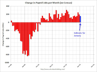 Click on graph for larger image.
From the BLS:
Total nonfarm payroll employment increased by 157,000 in January, and the unemployment rate was essentially unchanged at 7.9 percentThe headline number was below expectations of 185,000. However employment for November and December were revised up sharply.
...
The change in total nonfarm payroll employment for November was revised from +161,000 to +247,000, and the change for December was revised from +155,000 to +196,000[Benchmark revision:] The total nonfarm employment level for March 2012 was revised upward by 422,000 (424,000 on a not seasonally adjusted basis).
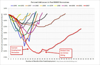 This graph shows the job losses from the start of the employment recession, in percentage terms, compared to previous post WWII?recessions. The dotted line is ex-Census hiring.
This shows the depth of the recent employment recession - worse than any other post-war recession - and the relatively slow recovery due to the lingering effects of the housing bust and financial crisis.
This was another sluggish growth employment report, but with strong upward revisions to prior months.
? Real GDP decreased 0.1% Annualized in Q4
The Q4 GDP report was negative, with a 0.1% annualized decline in?real GDP, and lower than the expected 1.0% annualized increase. Final demand increased in Q4 as personal consumption expenditures (PCE) increased at a 2.2% annual rate (up from 1.6% in Q3), and residential investment increased at a 15.3% annual rate (up from 13.5% in Q3).?
The slight decline in GDP was related to changes in private inventories (subtracted 1.27 percentage points), less Federal Government spending (subtracted 1.25 percentage points), and a negative contribution from trade (subtracted 0.25 percentage points).
Overall this was a weak report, but with some underlying positives (the increase in PCE and private fixed investment).? I expect the payroll tax increase to slow PCE growth in the first half of 2013 - and for additional government austerity - but I think the economy will continue to grow this year.
The following graph shows the contribution to GDP from residential investment, equipment and software, and nonresidential structures (3 quarter centered average). This is important to follow because residential investment tends to lead the economy, equipment and software is generally coincident, and nonresidential structure investment trails the economy.
For the following graph, red is residential, green is equipment and software, and blue is investment in non-residential structures. So the usual pattern - both into and out of recessions is - red, green, blue.
The dashed gray line is the contribution from the change in private inventories.
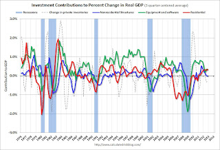
Residential Investment (RI) made a positive contribution to GDP in Q4 for the?seventh consecutive quarter. Usually residential investment leads the economy, but that didn't happen this time because of the huge overhang of existing inventory, but now RI is contributing. The good news: Residential investment has clearly bottomed.
The contribution from RI will probably continue to be sluggish compared to previous recoveries, but the ongoing positive contribution to GDP is a significant story.
Equipment and software investment increased solidly in Q4, after decreasing in Q3. This followed twelve consecutive quarters with a positive contribution.
The contribution from nonresidential investment in structures was slightly negative in Q4. Nonresidential investment in structures typically lags the recovery, however investment in energy and power has masked the ongoing weakness in office, mall and hotel investment (the underlying details will be released next week).
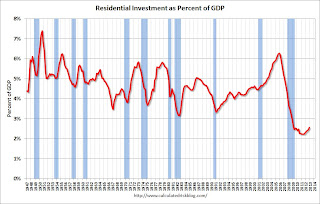 Residential Investment as a percent of GDP is up from the record lows during the housing bust. Usually RI bounces back quickly following a recession, but this time there is a wide bottom because of the excess supply of existing vacant housing units.
In 2011,?the increase in RI was mostly from multifamily and home improvement investment. Now the increase is from most categories including single family. I'll break down Residential Investment (RI) into components after the GDP details are released this coming week. Note: Residential investment (RI) includes new single family structures, multifamily structures, home improvement, broker's commissions, and a few minor categories.
The key story is that residential investment is continuing to increase, and I expect this to continue. Since RI is the best leading indicator for the economy, this suggests no recession this year or in 2014.
? Case-Shiller: House Prices increased 5.5% year-over-year in November
S&P/Case-Shiller released the monthly Home Price Indices for November (a 3 month average of September, October and November).
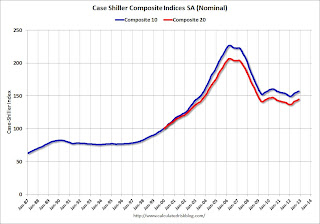 This graph shows the nominal seasonally adjusted Composite 10 and Composite 20 indices (the Composite 20 was started in January 2000).
The Composite 10 index is off 30.7% from the peak, and up 0.5% in?November (SA). The Composite 10 is up 5.3% from the post bubble low set in March (SA).
The Composite 20 index is off 29.8% from the peak, and up 0.6% (SA) in November. The Composite 20 is up 6.0% from the post-bubble low set in March (SA).
 The second graph shows the Year over year change in both indices.
The Composite 10 SA is up 4.5% compared to?November 2011.
The Composite 20 SA is up 5.5% compared to?November 2011. This was the?sixth consecutive month with a?year-over-year gain since 2010 (when the tax credit boosted prices temporarily).? This was the largest year-over-year gain for the Composite 20 index since 2006.
This was slightly?below the consensus forecast for a 5.8% YoY increase.
? ISM Manufacturing index increases in January to 53.1
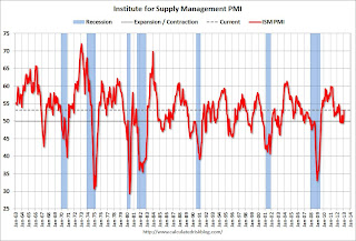 The ISM manufacturing index indicated expansion in January. PMI was at 53.1% in January, up from 50.2% in December. The employment index was at 54.0%, up from 51.9%, and the new orders index was at 53.3%, up from 49.7% in December.
Here is a long term graph of the ISM manufacturing index.
This was above expectations of 50.7% and suggests manufacturing expanded in January.
? Construction Spending increased in December
There are a few key themes:
1) Private residential construction is usually the largest category for construction spending, but there was a huge collapse in spending following the housing bubble (as expected).? This is now the largest category once again.? Usually private residential construction leads the economy, so this is a good sign going forward.
2) Private non-residential construction spending usually lags the economy.? There was some increase this time, mostly related to energy and power - but the key sectors of office,?retail and hotels are still at very low levels.
3) Public construction spending has declined to 2006 levels (not adjusted for inflation).??This has been a drag on the economy for 3+ years.
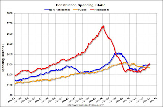 This graph shows private residential and nonresidential construction spending, and public spending, since 1993. Note: nominal dollars, not inflation adjusted.
Private residential spending is 54% below the peak in early 2006, and up 39% from the post-bubble low. Non-residential spending is 26% below the peak in January 2008, and up about 35% from the recent low.
Public construction spending is now 17% below the peak in March 2009 and at the lowest level since 2006 (not inflation adjusted).
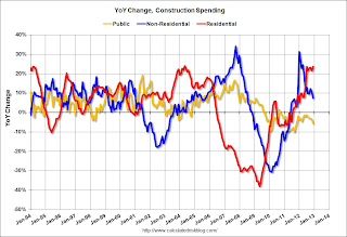 The second graph shows the year-over-year change in construction spending.
On a year-over-year basis, private residential construction spending is now up 24%. Non-residential spending is?up 8% year-over-year mostly due to energy spending (power and electric). Public spending is?down 6% year-over-year.
This was a fairly strong report - except for public construction spending - and this report suggests an upward revision to Q4 GDP.
? U.S. Light Vehicle Sales at 15.3 million annual rate in January
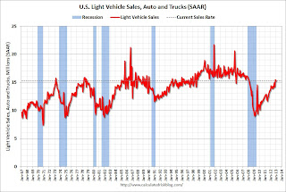 Based on an estimate from AutoData Corp, light vehicle sales were at a 15.29 million SAAR in January. That is up 10% from January 2012, and down?slightly from the sales rate last month.
This was at the consensus forecast of 15.3 million SAAR (seasonally adjusted annual rate).??
This graph shows the historical light vehicle sales from the BEA (blue) and an estimate for?January (red, light vehicle sales of 15.29 million SAAR from AutoData).
This is a solid start to?the new year.? ? After three consecutive years of double digit auto sales growth, the growth rate will probably slow in 2013 - but this will still be another positive year for the auto industry.
Even if sales average this rate all year, sales would be up about 6% from 2012.
? Weekly Initial Unemployment Claims increased to 368,000
 From the DOL "In the week ending January 26, the advance figure for seasonally adjusted initial claims was 368,000, an increase of 38,000 from the previous week's unrevised figure of 330,000. The 4-week moving average was 352,000, an increase of 250 from the previous week's unrevised average of 351,750."
The dashed line on the graph is the current 4-week average. The four-week average of weekly unemployment claims increased slightly?to 352,000.
Weekly claims were above the 350,000 consensus forecast, however the 4-week average is near the levels of early 2008.
Source: http://www.calculatedriskblog.com/2013/02/summary-for-week-ending-february-2nd.html
joey votto the masters live mega millions winner holy thursday chris stewart evo 4g lte marlins new stadium
No comments:
Post a Comment